

Description: Redesign the navigation for Big 5 Sporting Goods and identify customer pain points of shopping online to create a user flow and persona.
Timeline: 2 weeks.
Problem: Stacey (my persona) is a busy mom of 3 and they all play sports. She needs to buy affordable gear and the correct items to match the rest of the soccer team, but she doesn’t have time to go the store, nor does she have time to make returns.
Challenge: To simplify navigation and add a list management feature so Stacey can keep track of which correct items to buy for her son's soccer team.
Solution: To make it simple for Stacey to purchase the items she needs on a checklist from the coach in a one stop shop. This gives her more time for herself and the other tasks she needs to get done in the day.
Method: Surveys, personas, concept map, closed card sort, interviews, comparative and competitive analysis, usability testing, design studio method, sketching, prototype feedback, web layout, user flows, site map, navigation schema, and social media research.
Role: This was a solo project from start to finish with a design studio method session with 2 classmates.
Tools:


Research
quotes from yelp
I began my research on Yelp. Getting quotes from Yelp really helped me to figure out the pain points of the customers and the experiences they had when shopping at Big 5.

Concept Map
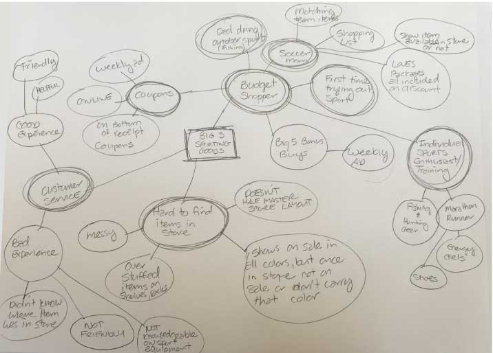
After gathering an overwhelming amount of social media research I used a concept map to help me figure out what where the key insights and take aways from the customers. These insights were used to better address the users needs and narrow down my multiple personas to one key persona.
Key Insights
The key take aways I received from concept mapping are:
Big 5 shoppers are budget shoppers and LOVE their coupons.
Customers either love or hate shopping in the store.
Customers biggest complaint is it's hard to find items in the store.
Primary customers are parents shopping for kids ages 3- 18 years.
Individual sports enthusiast training for an event or competition.
PERSONA
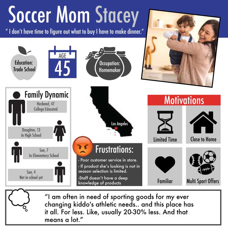
Meet Stacey my key persona. I was able to craft her from social media research, and observational research. Next I focused on how to create a better navigation to severe her needs.
C + C ANALYSIS
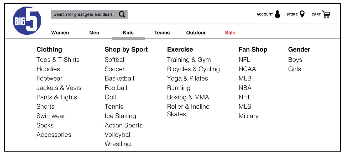
I used C & C analysis to compare Big 5 Sporting Goods navigation menu to 4 other competitors. The analysis allowed me to see how many categories were in the navigation menu, and what categories where listed in each navigation menu. The original Big 5 website had 10 categories and I designed the new navigation menu to have 6.

Closed Card Sort
Once I narrowed down the global navigation, I tackled the local navigation. To figure out what would be the best local navigation for my user I used a closed card sort to inform my decision on creating a mega navigation.


Design Studio Method
A week into the project, we explored the problem space deeper using the design studio method to flush out ideas to better serve our users. In the span of 10 minutes, we defined apersona, pain points and scenario. The next 5 minutes, we broke out into an individual brainstorm to create different possible user flows and features. Next, we presented our individual ideas to the group and took the best of the ideas and created unique features for our persona's needs. The feature we created was a team landing page where game/practice information, the coach's shopping list and contact information would be listed.

Persona, Individual Brainstorm, Team Brainstorm
Information Architecture
Site Map
Redesigning the site map was one of the most challenging parts of this project. My goal was to have 6 categories in the global and local navigation to create a faster shopping experience for my user. From contextual inquiry I discovered users where having trouble finding items by searching through the navigation. By simplifying the navigation menu I addressed the biggest pain point of my users, making it easier for Stacey to find what she's needs quickly.

Current design of Big 5 Sporting Good's global and local navigation.
Redesign of global and local navigation.
User Flow
Using the navigation menu Stacey's user flow is to find Nike cleats for her son, buy the cleats online and have them shipped to her house.

Web Layout
After simplifying the navigation menu I decided to also simplify the home page layout. From my contextual inquiry research I saw users where having a hard time focusing on the task I gave them because they got distracted by the home page. Lack of visual and information prioritization created a major distraction for the user. By redesigning the home page layout to a modular design users could regain their focus.

Visual Design
Medium Fidelity Prototype
The second iteration of the visual design of the prototype was streamlined even further from the modular layout. The clickable prototype was updated with a redesign of the logo and changing the header background to white. Changing the header to white popped the redesigned logo off the page and made it easier for the users to read the navigation menu.

Navigation Schema
My core principle in designing my navigation was to keep it predictable and simple. By using a global navigation with 6 categories it would easily direct the user to choose who they are shopping for. Next by using a mega navigation it shows the user an overview of all the options they have to choose from in clear and concise way.

Logo Redesign
On the left is the current Big 5 logo, and my redesign is on the right. I did competitive and trend research on competitors logos. I looked at competitors current logos as well as their brand's history of logos. Big 5 was founded in 1955 and has been apart of widespread American culture since 1988. Given Big 5's high brand recognition I decided to drop the "Sporting Goods" like many of their competitors did once they gained widespread brand recognition. A major trend to modernize a logo is to kept it flat, use 1-2 colors and make it symmetrical.

Current Big 5 Sporting Goods Logo

Redesign of Big 5 Sporting Goods Logo
Web Design Updates
After using testing my design here are the updates I included:
Added "Continue Shopping" button on shopping cart page. (User wanted to make sure items in cart would stay in cart if they wanted to continue shopping before checkout page.)
Changed "Add to Team List" o product detail page to " Add to Shopping List" ( User felt like they might mess up the team page so this wording it more for individual use.)
Added " Shopping List" to team page.
Added boxes to check off as a feature so the user could "check off" an item on their list, on the shopping list page.
Added Shopping List page.
What's Coming Next

Wireframes for Apple Watch App
Apple Watch App
The features will include the following:
Can add individuals ex, kids, husband, teammates.
Have multiple shopping list per individual.
Items are grouped in categories.
Can view item details.
Will show "checked" and "unchecked" items on list.